
Bitcoin Price Eyes $83K as TD Sequential Flashes Buy Signal Ahead of FOMC
 Samuel·1d ago

Bitcoin’s weekly candles just redrew a shape traders call distribution, and the same setup has shown up twice before with two very different outcomes.
Somewhere around three weeks ago, Bitcoin clawed its way back into the low $70,000s. Kept climbing too, oddly enough, all the way to something like $82,900 by early September, before it turned around and slid right back down. That round trip, messy as it looked, left the weekly chart’s shape more or less where it started. Still that same run of lower highs and lower lows, the one stretching back to the top of this cycle. Chart watchers have caught this exact shape before, twice, in the last two bear markets.
A blocked CLARITY Act vote and a fresh Federal Reserve rate hike knocked some wind out of the rally this week. Bitcoin sits around $76,430 as a result. That’s still well above where it traded back in June, but noticeably short of that early-September high.
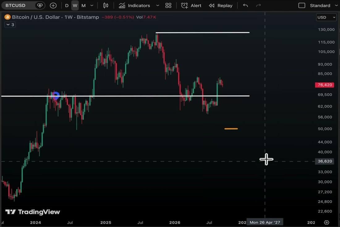
Bitcoin’s weekly chart, still tracing the lower-lows structure that has defined this cycle’s pullback. Source: TradingView
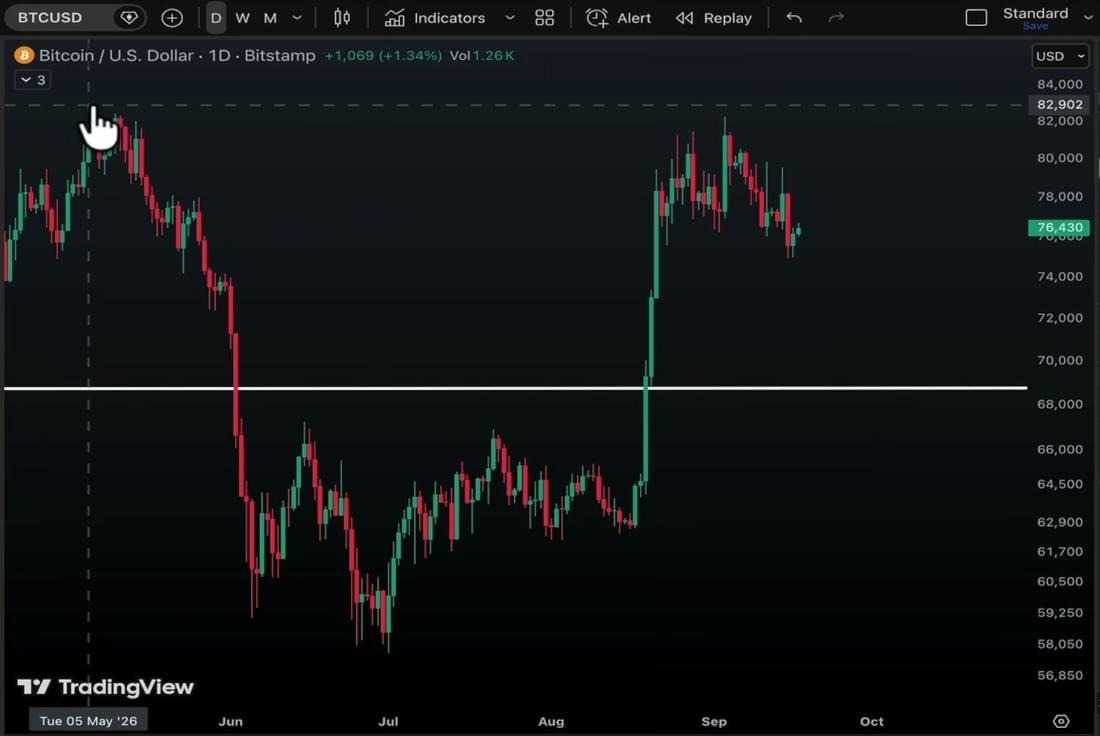
The daily chart shows the roughly $82,900 high from early September still capping price on the way back down. Source: TradingView
Zoom out on that weekly shape and it resembles something chartists call a distribution phase. StockCharts.com and Wyckoff Analytics mapped this structure out to describe how a market tests a range’s top and bottom before finally picking a direction. The textbook version runs through five phases. It starts with a buying climax and an automatic reaction, then a long stretch of testing highs and lows before the range finally breaks.
Bitcoin’s current chop lines up with the early-to-middle stretch of that structure closely enough that the setup leans bearish on paper. Maybe just over half the time this shape has resolved that way historically. Worth saying plainly, that’s a lean and not a certainty. None of this amounts to investment advice, just a read of how the pattern has behaved before.
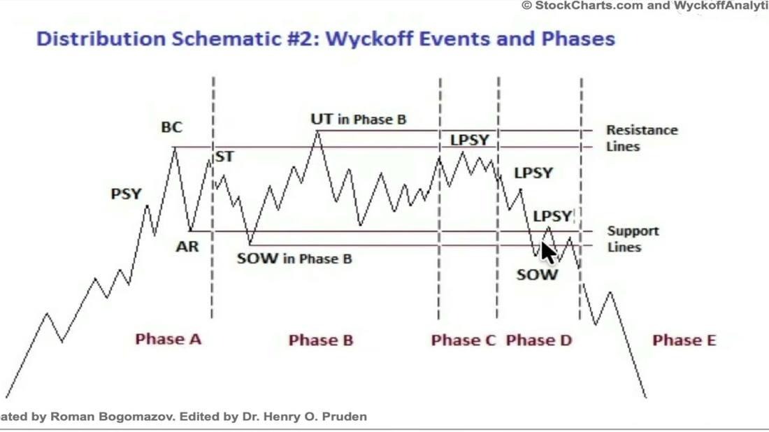
Wyckoff’s Distribution Schematic #2 maps the phases a trading range typically works through before it breaks down. Source: StockCharts.com and Wyckoff Analytics
Rewind to the last two crypto winters and the resemblance gets more specific. Late in the 2018 stretch, a chart shaped almost exactly like this one chopped sideways for close to a month. Then it finally broke higher. In the more recent 2022 winter, a nearly identical setup snapped upward within a single week instead, no extra month of chop required.
Both cycles eventually broke up.
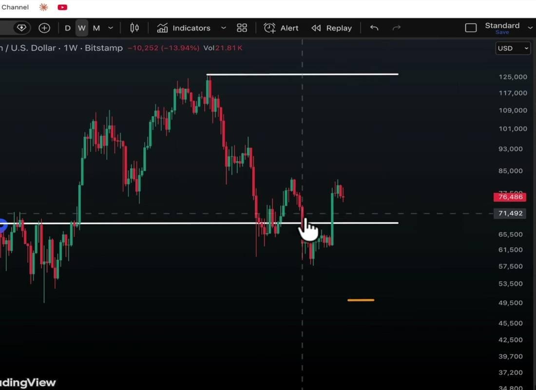
A near-identical weekly pattern from a prior cycle, one of two shapes Bitcoin has echoed before this exact setup. Source: TradingView
The timing wasn’t identical, though, and leaning on either script alone would’ve meant being early or late by weeks. A popular indicator called the TD Sequential recently flashed a buy signal on Bitcoin heading into this week’s Fed decision. Some traders read that setup as pointing back toward $83,000, if it behaves the way it has before.
August and September are supposed to be rough months for Bitcoin. CoinGlass’s monthly return data going back to 2013 shows August averaging a loss most years. September usually lands among the weakest months on the calendar too. This year flipped that script. August closed up close to 25 percent.
September, so far, is down only a couple of percentage points instead of the usual double-digit drubbing.
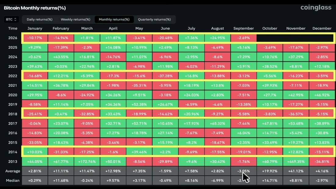
Monthly return data going back to 2013 shows just how unusual this August and September have been by comparison. Source: CoinGlass
The stock market carries a similar weak stretch, through late September into mid-October. That period also lines up with the Fed raising rates instead of cutting them, which tends to drag risk assets lower across the board. Whether Bitcoin keeps breaking its own seasonal script, or catches down to the historical pattern later, remains the open question heading into next month.
Bitbo’s four-year cycle model tracks price as a multiple of each cycle’s eventual low. It adds one more layer here. Every previous era on that chart, dating back to 2013, bottomed inside a strikingly narrow window measured in days from the halving. The current cycle’s line is sitting almost exactly inside that same zone right now.
That doesn’t guarantee a repeat.
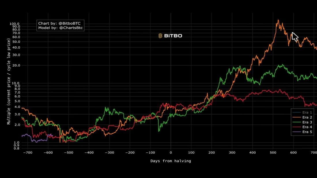
Bitbo’s four-year cycle chart tracks Bitcoin’s price as a multiple of each cycle’s eventual low, halving to halving. Source: Bitbo
It just means the setup rhymes. Splitting the odds somewhere around 60/40 feels about right. That leans toward this stretch being the tail end of the drawdown, not the start of a deeper one. The other side of that split hinges mostly on some kind of outside shock.
Think a credit event, or a policy surprise, not anything mechanical in the chart itself. LiveBitcoinNews’ Bitcoin coverage has tracked plenty of these setups playing out both ways across the last few cycles. Neither outcome looked obvious in real time. Dollar-cost averaging through a wide range, instead of hunting the exact low, is the unglamorous way traders tend to handle a split like this one.
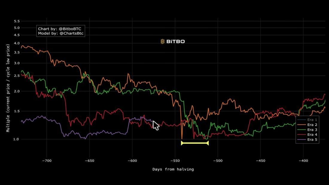
Every prior era on Bitbo’s chart bottomed inside this same narrow window, and the current cycle is sitting right inside it now. Source: Bitbo
It’s held up reasonably well, regardless of which side a given cycle landed on. Hindsight makes every one of these turns look obvious once it happens. Living through the sideways stretch in real time is the hard part. Nobody knows yet which of the last two cycles this one ends up copying.
Samuel·1d ago
 Emily John·1d ago
 Emily John·2d ago